 GARRAF
1 / 4
You can easily place your structured text, paragraphs, and standard media markup inside the main content container. The global style prefix ensures your imported structures display consistently without breaking external formatting.
Yes, all embedded media containers utilize modern CSS flexbox grids and max-width constraints. This design maintains proper aspect ratios and fluid resizing for mobile, tablet, and desktop viewports.
Using a dedicated namespace avoids layout overlap and property overrides between our styling sheet and your content management system's global style rules, keeping the integration clean.
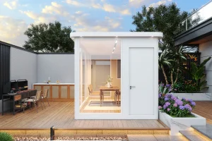
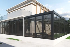
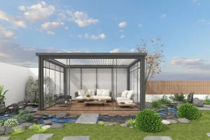
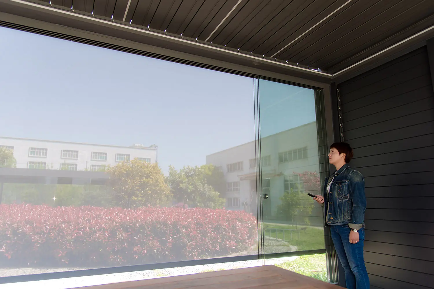
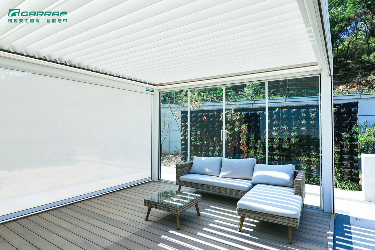
You can place multiple elements within the predefined image gallery container. On large displays, it aligns elements into 2 or 3 columns, automatically scaling down to single columns for optimized mobile browsing.
Per optimization guidelines, hyperlinks within this block have been clean-stripped or converted to plain text format to focus user navigation strictly on target specifications and descriptive details.